Studio Apartment Decor Ideas That Make a Tiny Space Feel Intentionally Designed

There is a particular kind of frustration that comes with a studio apartment — not the square footage itself, but the feeling that no matter what you do, the space never quite looks like a decision was made. A sofa pushed flat against a wall. A bed that dominates the room by default. A kitchen that bleeds into the living area without any natural pause. I know that feeling intimately, and I also know it is completely fixable — not with more storage bins or a clever IKEA workaround, but with deliberate design choices that signal to anyone who walks in: this space was considered.
The difference between a studio that feels cramped and one that feels curated comes down to a handful of key moves — how you define zones without walls, how you direct the eye upward, and which pieces you allow to do more than one job without making a show of it. None of what follows requires a renovation, a landlord's permission, or anything beyond a weekend of rearranging and a few well-chosen Amazon finds.
- The rug sizing mistake that makes studio apartments feel half their actual size
- Why a traditional sofa might be the wrong anchor for a one-room space
- How to create the illusion of separate rooms without touching a single wall
- The lighting swap that instantly reclaims four square feet of floor
- 12 products that earn every inch they occupy by doing three jobs at once

Anchor Every Zone with an Oversized Area Rug
In a studio apartment, your rug is doing the architectural work that walls would normally do — and the single most common mistake I see is going too small. A 5×7 rug that floats beneath just the coffee table anchors nothing; it actually emphasizes the emptiness around it. The moment you drop an 8×10 or 9×12 beneath your seating area, with all four legs of every piece resting on it, the room instantly reads as having a defined living zone. The rug becomes a visual boundary, telling the eye where the lounge ends and everything else begins. A jute-cotton blend in warm oatmeal or undyed natural works beautifully across almost every studio palette — grounded and warm without competing with anything else in the room. Bold tip: size up by at least one step from what your instinct tells you — if you think you need a 6×9, you almost certainly need an 8×10.

Choose a Daybed Over a Traditional Sofa
A traditional sofa in a studio creates a quiet but persistent problem: it claims one entire wall for the sole act of sitting, while your bed claims another for sleeping — and you've used two pieces of furniture for essentially the same function. A linen-upholstered daybed threads that needle without compromise. Against the longest wall, it reads as a sofa during the day, especially when styled with structured throw pillows and a folded blanket. At night, it's a proper bed without a fold-down mechanism or a visible mattress situation. The two storage drawers underneath hold off-season clothing, extra bedding, or all the things that would otherwise become a pile on the floor. Bold tip: position the daybed perpendicular to the window rather than parallel — it frames the view and draws light into the center of the room rather than sitting in front of it.

Swap Wide Shelving for a Tall, Narrow Ladder Bookcase
Wide, low bookshelves spread horizontally and consume wall real estate that could be doing better work. A narrow 72-inch ladder bookcase, by contrast, draws the eye upward — which is the single most reliable trick for making low ceilings feel higher and compact rooms feel larger. Positioned in a corner, it occupies dead vertical space and becomes a design feature rather than a utility piece. The tapered silhouette keeps the visual weight light, and with adjustable shelves, it can hold books and files on the lower levels while graduating into a styled display surface at the top. Run your eye up it: it should feel curated by the time it reaches the ceiling, not crammed. Bold tip: leave the top shelf entirely open for display only — a trailing plant, a ceramic, one candle. Clutter at the top of a tall piece defeats the whole upward gesture.

Install a Wall-Mounted Fold-Down Desk
A dedicated workspace in a studio is a sanity investment, not a luxury. Without one, you end up working from your daybed — and once the daybed starts to feel like your office, it stops feeling restorative, and nothing in the space feels like what it's supposed to be. A wall-mounted Murphy-style fold-down desk resolves this completely. Open, it's a full work surface with a built-in organizer shelf and a cable slot that keeps cords invisible. Closed, it presses flush to the wall and returns those square feet entirely to the room. Mount it at bar height — around 42 inches — and pair it with a counter-height stool to create a workspace that takes up zero visual footprint when not in use. Bold tip: position it directly beside the tall bookcase from item 03 — the two pieces read together as a deliberate work nook, not as furniture scatter.

Hang Floor-to-Ceiling Curtain Panels as Room Dividers
The psychological discomfort most people feel in a studio doesn't come from its size — it comes from the absence of zones. When your sleeping corner bleeds into your lounge bleeds into your kitchen with no natural pause, the whole space reads as one unresolved room. Floor-to-ceiling linen curtain panels on a ceiling-mounted track address this without any structural work or landlord approval. Draw them closed for a sleeping alcove at night; pull them fully open during the day to let the space breathe and feel generous. I've tried several configurations, and the detail that matters most is the pool: letting the fabric fall an inch or two past the floor makes them look architectural rather than functional. Bold tip: leave one end of the track free-swinging rather than fixed — the asymmetry makes the divider look considered, like a design choice, rather than a practical workaround.
Before placing a single piece of furniture, sketch your four zones on paper first. A studio that functions well needs at least: sleep, lounge, work, and kitchen. If you can't draw all four without them visually overlapping, the layout needs to change before the shopping begins. The pieces in this list are flexible enough to shift those zones around you — but only if you've decided what you're building before you start filling the space.

Lean a Full-Length Arched Mirror on Your Longest Wall
I used to think mirrors in small spaces were a decorating cliché — until I tried one and understood immediately why designers return to them. An arched floor mirror at 65 inches or taller, leaned against the longest wall, does three distinct things at once: it bounces ambient light back into the room, it creates the optical illusion of depth (the reflected space reads to the brain as a continuation of the room itself), and it functions as a genuine style statement. The arch specifically adds an architectural gesture that a rectangular mirror never quite achieves — it signals that something deliberate happened here. A thin gold or matte black frame keeps the piece elegant without competing with the rest of the room. Bold tip: angle the mirror very slightly off-perpendicular — a gentle lean ensures it reflects your window rather than the wall opposite, maximizing the light bounce where it matters most.

Replace Your Coffee Table with a Set of Nesting Tables
A coffee table in a studio is a commitment that rarely earns its footprint. It claims a fixed territory in the center of the living zone and, in my experience, mostly functions as somewhere to put down mugs and lose the TV remote. A set of three nesting tables with marble-look surfaces and gold or black metal legs gives you the same total surface area with dramatically more flexibility. Pull all three apart when you have guests; nest them flush against the daybed to clear the floor for a yoga mat or a spontaneous rearrange. The smallest table in the set earns its keep year-round as a nightstand, positioned beside the daybed with a candle and a stack of books. Bold tip: vary the heights you use them at rather than keeping all three level — the visual stagger makes the arrangement feel styled, not functional.
Mount Your Lighting — Get It Completely Off the Floor
Floor lamps are quiet space thieves. Each one occupies a footprint of roughly two square feet — and in a studio, two square feet has weight. A pair of plug-in wall sconces with adjustable swing arms, mounted at about 60 inches on either side of the daybed or beside a reading chair, does everything a floor lamp does while returning that floor space to you entirely. The braided cord routes cleanly behind a narrow piece of furniture and disappears. No electrical work, no wiring, no landlord conversation — just a toggle plug. A linen drum shade diffuses the light softly, avoiding the clinical overhead quality that makes studios feel like hotel holding rooms. Bold tip: choose sconces with a true built-in dimmer rather than relying on a smart bulb — the ability to dial down to a low warm glow in the evening transforms the entire atmosphere of a one-room space.

Add a Storage Ottoman That Hides Everything It Does
The round tufted storage ottoman is, in my experience, the most productive piece of furniture a studio can contain — and its best quality is that it looks like it's doing nothing useful at all. Run your hand across the velvet surface and it reads as purely decorative. Lift the removable tray lid and there is 50 liters of storage inside: extra blankets, chargers, off-season scarves, or anything that would otherwise create visual noise in a one-room space. In active use it serves as a coffee table with the tray top in place, an extra seat for guests, and a footrest. The round form is also intentional: in a studio where every corner must be navigable, curved furniture removes the shin-level hazards that angular pieces inevitably create. Bold tip: keep your most beautiful throw inside and pull it out when someone visits — it reads as effortless hospitality from zero visible effort.

Float a Pair of Shelves Above Your Kitchen Counter
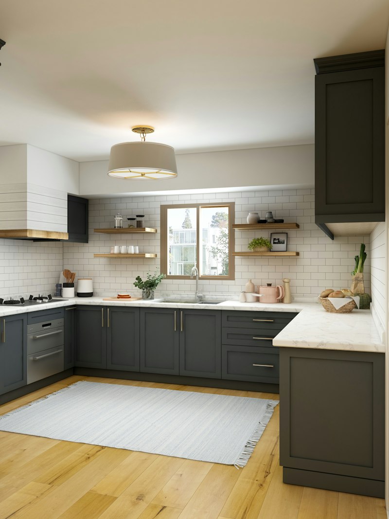
In a studio, the kitchen doesn't get to retreat behind a door — it's part of the main visual field at all times. That makes it a design decision, not merely a functional zone. Two solid pine floating shelves with invisible brackets, installed about 18 inches above the counter, move everyday kitchen items off the work surface and into vertical display mode. The result is a counter that's genuinely usable for meal prep and a wall that reads as curated rather than utilitarian. Your most beautiful bowls stacked on the lower shelf, olive oil and salt in vessels worth looking at, your most-used mugs within easy reach — the kitchen becomes a composed still life that happens to be functional. Bold tip: stagger the shelves at slightly different heights rather than spacing them evenly — the asymmetry signals a considered hand rather than a catalog installation.

Lean a Headboard Panel Instead of Bolting One
Without a headboard, the sleeping corner of a studio reads as a mattress situation — functional, impermanent, and visually incomplete. A headboard changes the psychology of that corner entirely. It tells the eye: this is a bedroom. An upholstered linen panel headboard with a solid wood trim base leans against the wall without drilling, without permanent commitment, and without any landlord negotiation. The natural linen is warm to the touch and soft to look at; the wood base trim gives it a finished, grounded quality that a raw upholstered edge never quite achieves. It looks like a design choice — because it is one. Bold tip: pair it with the plug-in sconces from item 08, mounted just above the headboard's top edge on either side — together they create a complete bedroom vignette that reads as designed from the other side of the room.

Hang Curtains from Ceiling to Floor — Never Window to Sill
This is likely the single highest-impact move you can make in any studio apartment, and it costs less and takes less time than almost everything else on this list. Extra-long semi-sheer linen curtains — 96 or 108 inches — hung from a rod mounted within an inch of the ceiling, drop to the floor in full soft columns. The room appears taller. The windows appear larger. The entire wall reads as an architectural feature rather than a window with curtains hung beside it. The semi-sheer quality keeps natural light flooding in while softening any harshness from direct sun. Choose a width at least double, ideally triple, your window so the panels gather with real fullness when open — fullness is what separates this from a dorm room. Bold tip: mount the rod at ceiling height without exception — the extra 12 to 18 inches of vertical drop above the window frame is precisely where the transformation lives.
A Studio That Feels Like a Choice — Not a Compromise
The shift from a studio that reads as cramped to one that reads as curated is not about spending more or owning less. It is about being specific. Every piece here earns its place not simply by looking right, but by doing more than one thing, by respecting the visual logic of the room, and by contributing to a space that holds up as intentional from every angle.
In my experience, the transformation happens in two distinct stages: the zone-defining moves first — the rug, the curtain dividers, the ceiling-height curtain drops, the sconces off the floor — and then the layer of personality that sits on top: the arched mirror, the leaned headboard, the floating kitchen shelves styled with care. Get the structural decisions right first. Every decorative choice you make afterward will land better and feel easier when the bones of the room are already working in your favor.
Start with whichever item here addresses your most persistent frustration — the visual chaos, the lack of zones, the bedroom corner that never quite reads as a bedroom. One deliberate change in a small space has a way of making the rest feel possible.


Comments
Post a Comment